06
Imagery
 Allie Reilly
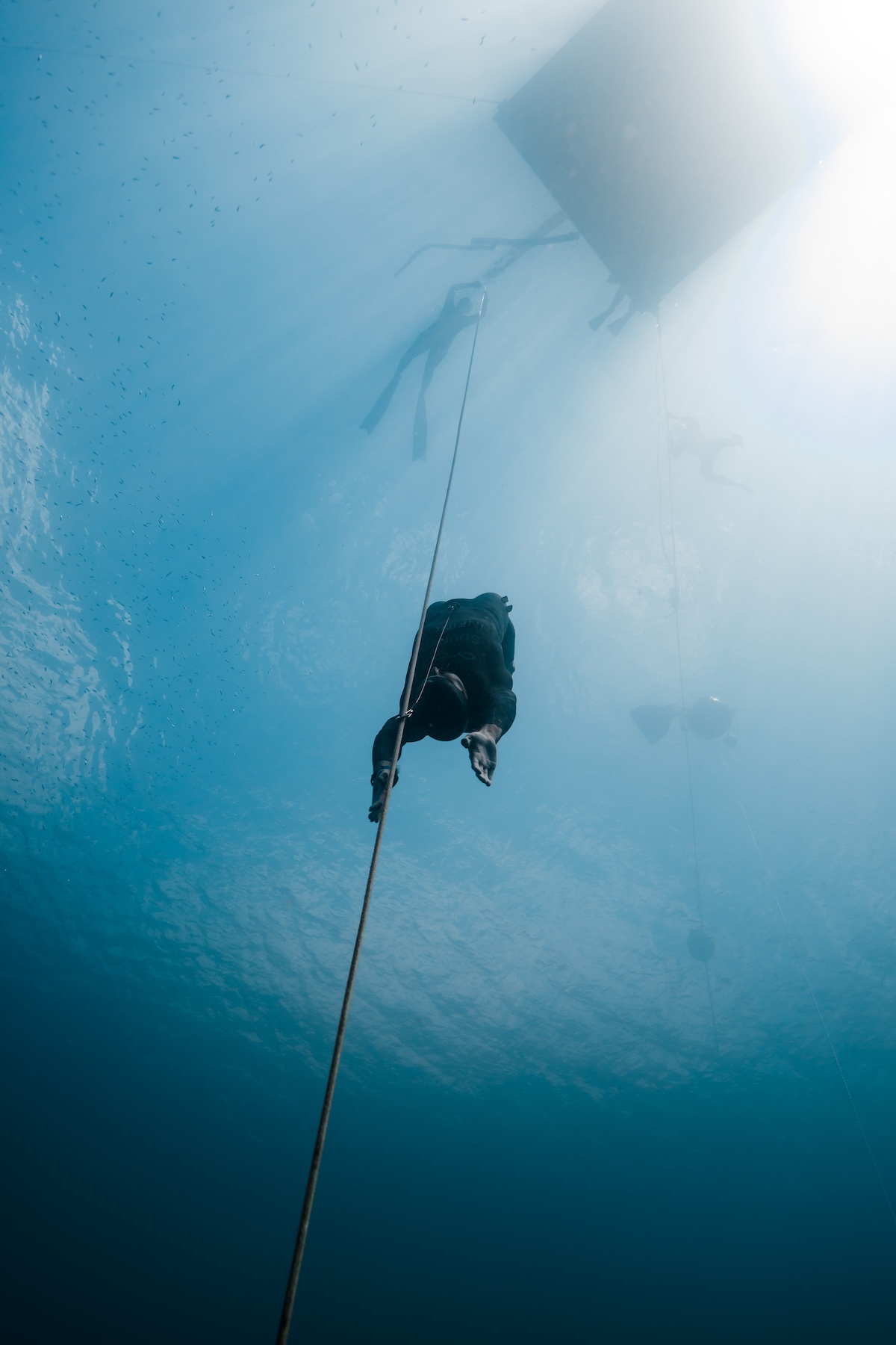 Allie Reilly
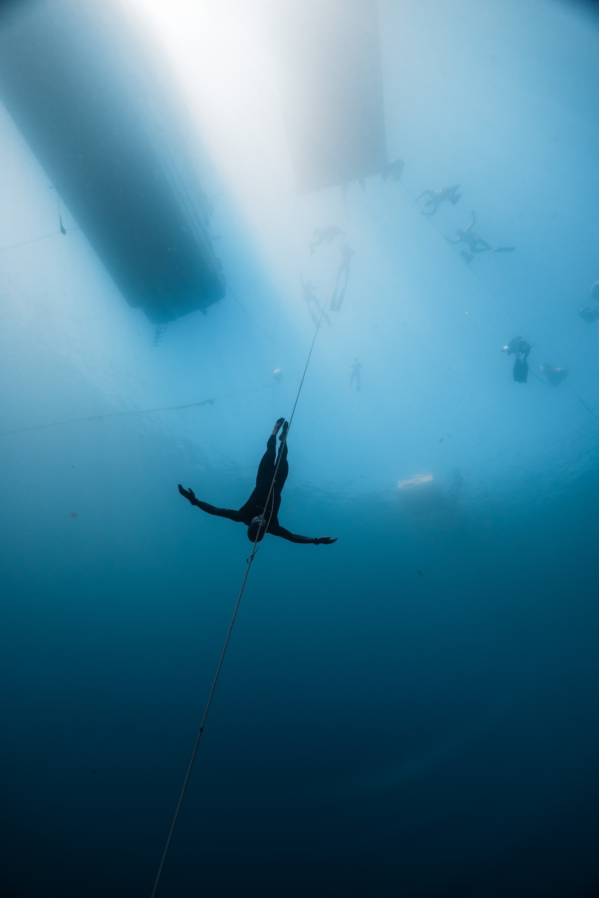 Allie Reilly
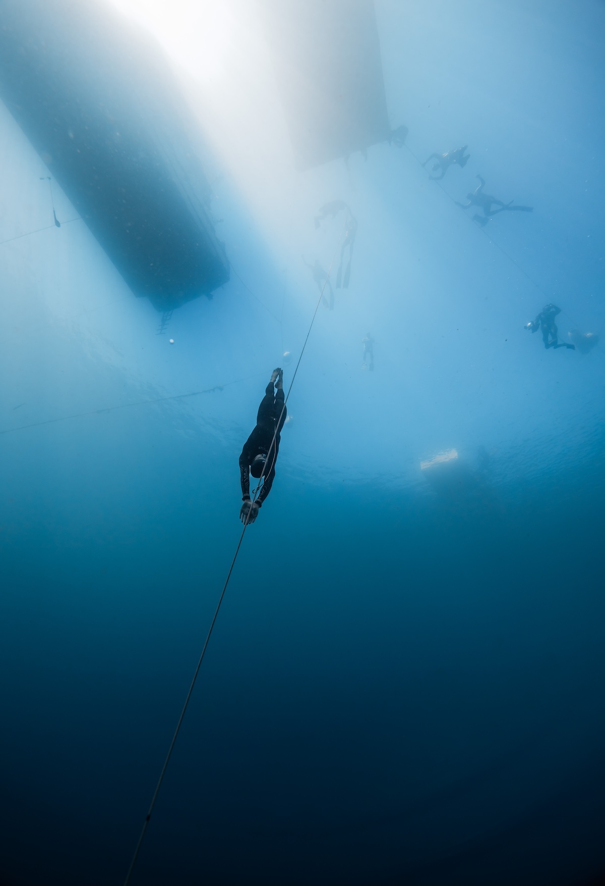
Do: underwater wide shots with a single figure and vast blue negative space. Natural light from above; let the diver be small against the deep. Cool, monochromatic blue grading consistent with the palette.
Avoid: cluttered gear close-ups, oversaturated tropical-postcard looks, busy text overlays. The mood is meditative, not adrenaline.
All photography · Allie Reilly